Visual Identity

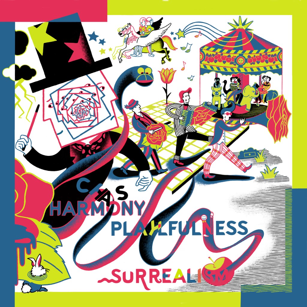
I needed to be clear to my clients about my unique style and way of doing my visuals. So I took elements of my work and put them together with some key words so I create a clear visual identity. I am using this visual on several online platforms, as my physical portfolio’s first page and my A5 business card for clients that need to know specifically what I do, replacing a small logo or spot illustration that does not show it all.
From Book to Poster

This was the very first drawing I created in what would become my current visual identity. I originally made it as part of my Master’s thesis on illustrated films with open endings. This one illustrated the french movie Jeux d’enfants by Yann Samuell. Years later, the French Institute of Aachen invited me to create an exhibition for the Aachener Kunstroute event at the Aula Carolina, exploring the relationship between France and Germany. I revisited my French film illustrations from the book and created new ones inspired by German cinema (you can check my artworks here: Metropolis, Run Lola Run).
LinkedIn, Instagram, Behance and my Website
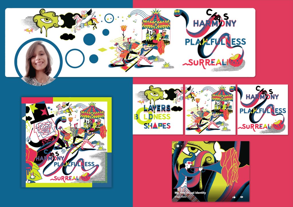
After receiving several positive feedback from both professionals and my surroundings, I decided to use this style of illustration as my visual identity. I added keywords that best describe my style and wrote them in a way that fits my illustration. I adapted the original creation to multiple platforms: from LinkedIn, by adding my photo to it, to Instagram, dividing the visual into three parts so I have a nice grid, to my Behance, making the cover image more minimalistic, and to this website.
My Big A5 Business Card
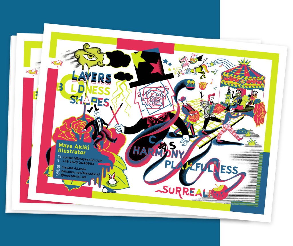
I designed an A5-sized business card to catch the eye of potential clients. I tested it out at the Salon du Livre de Montreuil and at the E-Commerce Berlin Expo, and it didn’t go unnoticed. Almost everyone I gave it to commented on how beautiful it was. Compared to my older, smaller business cards (which were also illustrated), I had never received such clear and enthusiastic feedback about the quality of the illustration. It is not always easy to carry it around or hand it out casually when I meet people. In those situations, I usually give out my standard-sized business cards instead.
Printed Illustration Portfolios
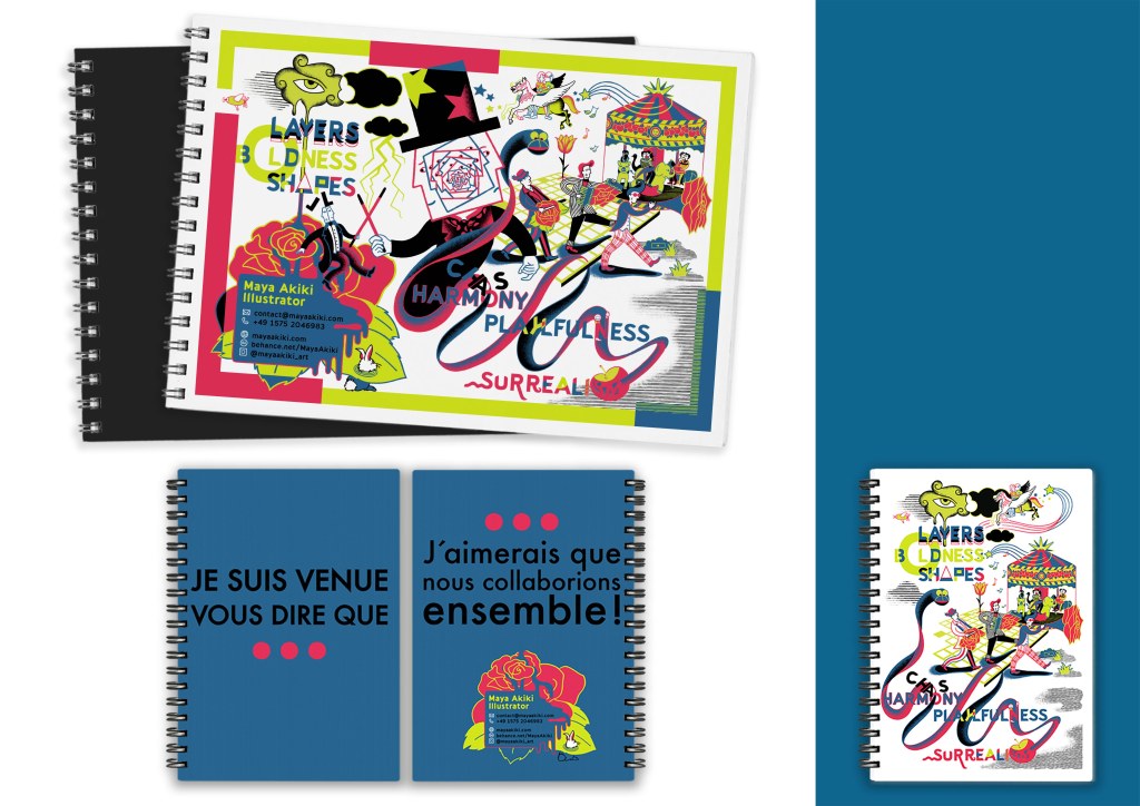
I first created an A3 physical portfolio with this same image as the cover and included all my projects that I did in the same style inside it. I took it with me when literally knocking on the doors of publishers and magazine companies in Paris and during book fairs. Most of the time, I felt that it was too big. I decided to create another version in A5 format, which I could more easily take with me anywhere and could also send by mail to potential clients. On the first page, I wrote: “Je suis venue vous dire que…” (“I’ve come to tell you that…”) and on the last page: “…J’aimerais que nous collaborions ensemble!” (“I would like for us to collaborate!”). My main “visual identity” image was part of the inside pages along with other projects.