Kalli Café – Logo

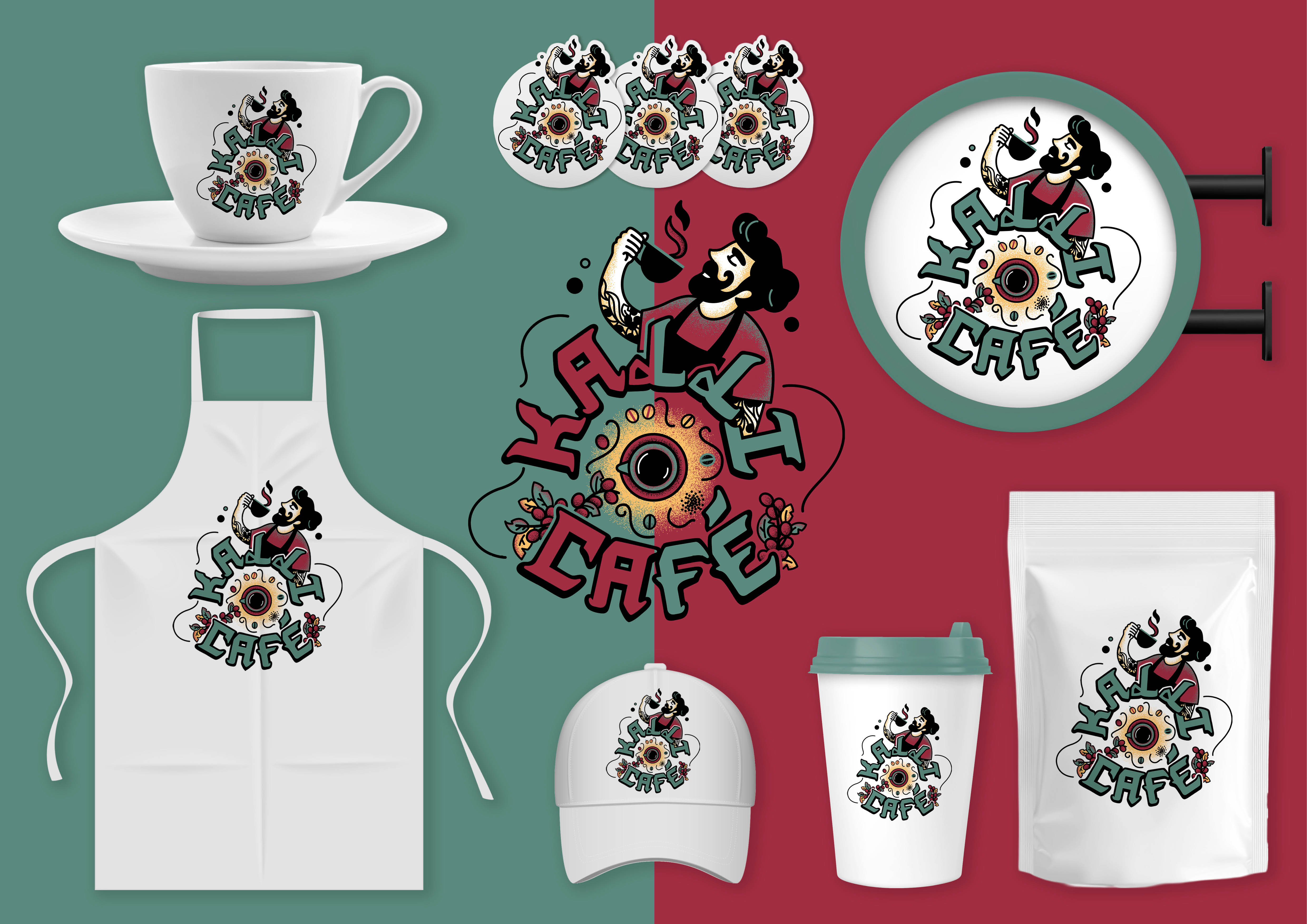
Kalli Café’s barista needed a versatile logo for his brand, one that could be used across a wide range of applications without major modification: coffee cups, clothing, stickers, merchandise, and the shop sign.
The name “Kalli” is inspired by the word “Calligraphy”, reflecting his desire for an artistic identity that celebrates the craft of coffee-making.
As a Syrian-German brand, the logo needed to appeal to both cultures. That’s why the final design is modern and playful, while still feeling authentic, thus, the coffee cycle in the middle. The character in the logo has a cool Arab look, capturing the unique personality behind the brand.
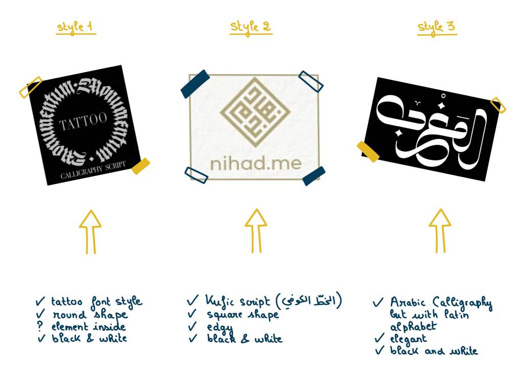
Moodboard 1

The client was not sure about which direction to take for the design of his logo. Only one thing was clear: he wanted a beautiful font to reflect his company’s name and the word “Calligraphy”. The font could be either in a tattoo style or in an arabic calligraphy style. The images were provided by the client and I made sure in my moodboard to clarify what he likes in each example so when doing the drafts I don’t miss key elements.
Drafts: round 1

I often do many logos options because usually the clients are not sure about the direction they want. I am firstly a creative, and then, an illustrator, so I am here for this: to help my clients decide on the overall vibe of their design. After the first round of drafts, one option was eliminated. The two options left had very different feel, but at this early stage of building his company, the client needed me to help him think through the overall branding, starting with the logo. We both liked the two remaining options, but I felt that something was missing. We needed a character. The company has a very specific artistic, authentic, friendly and cultural vibe. I cannot convey all this with only typography.
Moodboard 2

We needed a cool arab character and some extra elements related either to coffee and the expertise of the barista or calligraphy and the artistic vibe of the company.
Drafts: round 2

Before finalizing the logo and creating a high-quality vector version, we conducted a small survey among Germans and expats living in Germany: 14 out of 15 participants chose the first option. Since they are Kalli Café’s audience, we trusted them.
Insights

The idea of the bun came because of the client and owner of Kalli Café has a bun

The tattoo is made from the round shape of the coffee’s fruit 〇, its leaves 🍂 and some lines that symbolizes the coffee’s steam ∿

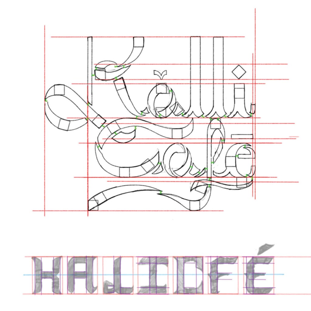
The font(s) are made 100% from scratch
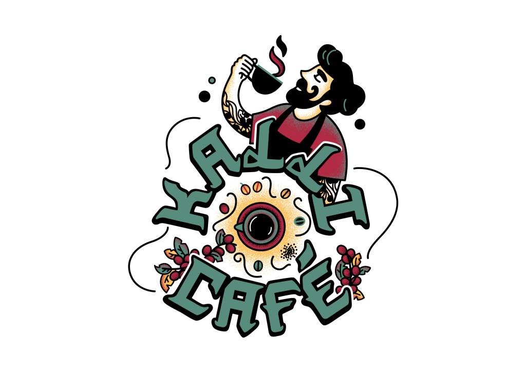
Final logo

Font: artistic, edgy, modern, “tattoo” style, calligraphic (decorative and handwritten)
Elements around the font: coffee bean’s colorful fruits for a fresh and authentic feel
Character: barista, Arab, cool, young
Central element: the coffee cycle to show the expertize of the barista
Mockups
